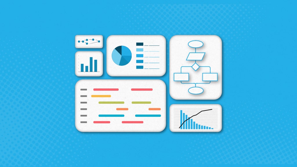
Project managers often struggle to effectively monitor progress, identify bottlenecks, and make data-driven decisions. Fortunately, project management charts offer a powerful solution to these challenges. Project management charts are valuable tools for navigating project managers through complex projects.
These data visualization tools provide project managers with insightful information about projects through charts and help steer projects in the right direction while ensuring better quality deliverables.
There are many charts you can use in the project management. Here is the list of popular project management charts:
- Gantt chart
- PERT chart (Program Evaluation Review Technique)
- Network diagram
- Kanban board
- Burn-up chart
- Burndown chart
- Milestone chart
- Timeline chart
- Work breakdown structure
- Pareto chart
- Control chart
- Flowchart
- Pie chart
- Bar chart
- CPM chart (Critical Path Method)
- RACI chart
- Cause-effect chart
- SWOT analysis
- Eisenhower matrix
- Power-Interest matrix
Now, before diving into the details. Let’s cover the basics first.
What is a project management chart?
A project management chart is a visual tool used to display important project information in a clear and organized manner. It helps project managers understand tasks, timelines, and resource allocation easily. The most notable thing about charts used in project management is that they make it easier to understand complex project data.
There are several types of charts that project managers use to analyze and monitor different aspects of their projects. While some project management charts, like Gantt charts, are used extensively, others, like Pareto and control charts, have limited usage.
A Free guide to help you with proven ways to lead a project from start to finish, without confusion or jargon.

Why project management charts are important?
For simple and small projects, there is a limited set of data that you need to observe throughout their life cycles. However, as the complexity of the projects swings up, you need to keep track of more and more data. This is where project management charts can be of great help.
The most significant advantage of using project management charts is that they allow you to analyze and extract helpful project information without hassle. These charts arrange data systematically and make it easier for you to evaluate project data.
Here are some key benefits of project management charts that you will find interesting:
- Eliminate the need for moving back and forth to collect project data and, thus, save a lot of time
- Help you to stay updated about what’s happening with the project
- Promote collaboration among team members
- Allow you to have better clarity and understanding of the project
- Project tracking becomes simple and effective
- Assist in making better changes to the project plan and cope with unexpected issues
Before moving further, I want to clarify that these benefits are common among most project management charts. However, you need to know that every project management chart has benefits that suit a particular situation or project.
List of most important project management chart types
Hopefully, you have developed a good understanding of how different charts used in project management allow you to manage your projects smartly. Now, it’s time to get familiar with the project management charts that are highly popular among managers, so instead of listing all the charts, we have mentioned 20 charts that you will be using as a project manager:
1. Gantt chart
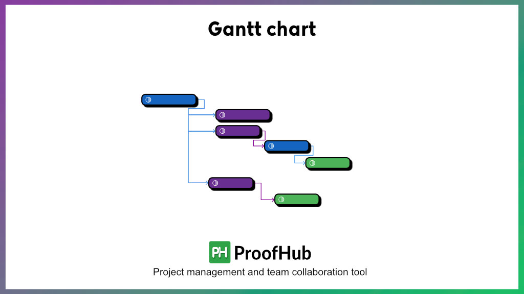
Gantt charts are undoubtedly the most prominent project management charts modern businesses and managers use to control their projects. It provides you with a timeline view of your projects. It allows you to visualize how different tasks/activities of a project are connected and how they fit into the project timeline.
It is a variation of the bar chart and is relatively easy to interpret. The vertical axis of a Gantt chart represents the project’s tasks, while the horizontal axis represents the time duration.
At present, many leading online project management software like ProofHub offer interactive Gantt charts to help you stay on top of all your projects.
The best thing about online Gantt chart tools is that they are easy to use and allow team collaboration. You can use a online Gantt charts to plan projects, schedule and assign tasks, set task dependencies, associate project milestones with tasks, and track progress. Additionally, you can identify the critical path of a project, which lets you estimate the project duration.
Gantt charts provide a subtle way of organizing all the essential project data in one place and increasing team productivity. Moreover, you can use these charts to manage your projects using the critical path method (CPM).
You can manage all your projects effectively using ProofHub’s interactive Gantt charts. Sign up to try them for free!
2. PERT chart
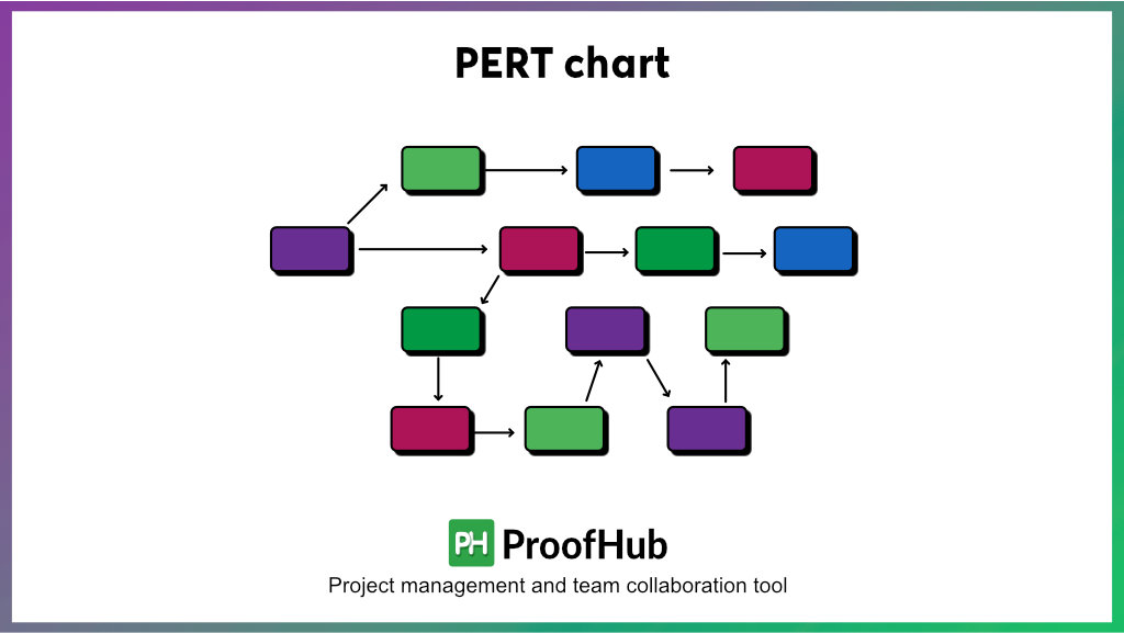
The PERT chart is another popular project management chart for scheduling, controlling, and monitoring project tasks. The PERT acronym for Program Evaluation and Review Technique is one of various industries’ most popular project management methodologies.
A PERT chart represents the activities and milestones of a project in the form of a network diagram. Interestingly, the PERT and CPM methods have many similarities and both these methods are sometimes used simultaneously to manage projects.
The most significant difference between the two techniques is that CPM is suitable for managing project activities having specific time durations. In contrast, PERT is best for managing activities with uncertain time durations.
A PERT chart includes circles and arrows. The circles depict the project activities, and the arrows represent the progression of the activities. With a PERT chart, you can identify a project’s critical and non-critical activities. The chart also provides information about parallel activities that you can undertake simultaneously to speed up project development without putting excess pressure on the resources.
You may find PERT charts a little complex when using them for the first time. However, it will not take much time for you to understand them and leverage their power to organize projects constructively.
3. Network Diagram
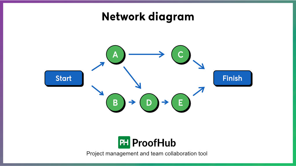
A network diagram, also known as a project schedule network diagram, is one of the popular tools for project management. It provides a sequential representation of all the tasks and activities and their dependencies to complete a project.
This is further classified into the Arrow Diagram Method (ADM) and the Precedence Diagram Method (PDM).
The Arrow Diagram Method (ADM), or Activity on Arrow, helps managers identify the critical path and optimize project scheduling. It consists of nodes and arrows, with the former representing activities or tasks and the arrows indicating activities. The length of the arrow represents the task duration, with its tail marked as the beginning and the head indicating the completion. An ADM chart can only depict a “finish-to-start” (FS) relationship between nodes and activities.
The Precedence Diagram Method (PDM) or Activity on Node diagram focuses on managing dependencies, identifying bottlenecks, and optimizing resource allocation. In a PDM chart, each node represents an activity, and arrows depict their relationship. A PDM chart supports four types of relationships:
- Finish to start (FS): When one task can only begin when the previous one is finished.
- Start to start (SS): When two tasks can start simultaneously.
- Finish to finish (FF): When one task can’t be completed until the previous task is finished.
- Start to finish (SF): When one task can’t be completed until the previous task starts.
4. Kanban Boards
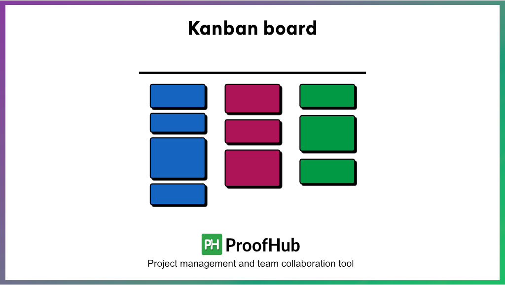
Kanban board is a project management tool that helps you visualize and optimize your workflow. The board consists of columns representing different workflow stages; each column contains cards representing individual tasks. These cards mostly move from left to right across the board as work progresses through the various stages.
Kanban boards are widely used because of their simplicity, flexibility, and focus on continuous improvement. It provides a clear and visual representation of work in progress, allowing team members to quickly understand what tasks are being worked on, their current status, and what needs to be done next.
Kanban boards are a good project management chart as they can help managers visualize the progress of various tasks, identifying bottlenecks and progress accordingly.
You can try ProofHub’s Kanban for project management. Sign up for free here
5. Burn-up Chart
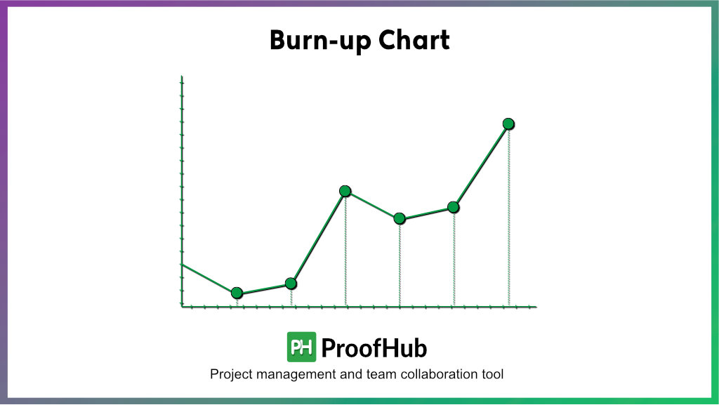
Tracking progress is essential to assess whether the project will be completed on time. A burn-up chart makes it easier for you to monitor project progress and also provides information about the pending work.
By using a burn-up chart, you will be able to visualize the total amount of work and the completed work altogether. Usually, the vertical axis of the chart depicts the number of tasks or amount of work, whereas the horizontal axis represents the time duration which may be in hours, days, or weeks.
As a manager, you will find burn-up charts handy for assessing the speed at which the work is executed. Furthermore, the data will help you adjust your project plan and make it more effective.
There are two key benefits of burn-up charts: they help you to determine if the project development is going at the right speed, and they can easily accommodate any changes in the project scope. The latter means that if there is an addition of new work or tasks in a project, it can be included in the burn-up chart without any trouble.
Although burn-up charts are not available across many project management tools, there are certain software, like ProofHub, that lets you create interactive burn-up charts for your projects almost instantaneously.
6. Burndown chart
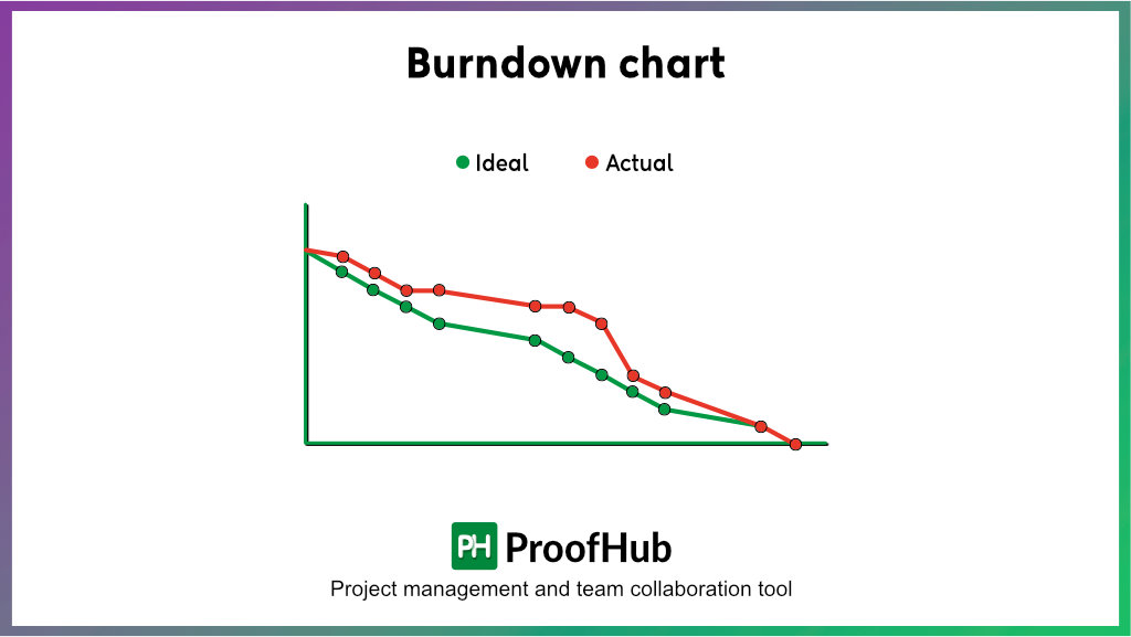
Burndown chart is another useful tool in project management to identify the work left to be completed. It is like a line chart, most commonly used in agile project management to track the progress cycle and determine current status.
A burn-down chart’s vertical axis (y-axis) represents the remaining task, while the horizontal (x-axis) depicts the timeframe. It allows you to plot estimated or ideal task duration and time spent, helping you identify discrepancies, delays, and due dates. Do not expect linear progression, as real progress often fluctuates above or beyond the expected path.
Managers can use a burndown chart to proactively identify potential risks, estimate task duration, and provide an overall summary of project progress. They can utilize the information to ensure the project gets delivered on time and adjust for future resources. Additionally, the chart can be shared with stakeholders to keep them updated and on the same page.
7. Milestone chart
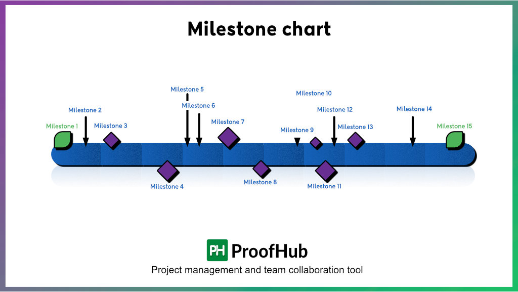
A milestone chart, the simplest of all the project management charts, is a visual representation of all the milestones in your project schedule. Also known as milestone timelines or diagrams, the one-dimensional chart keeps your team in alignment with the project objectives and provides clarity on “What have you achieved so far?”
A milestone chart has four major components: milestones, timeline, tasks, and dependencies. Milestones are your project’s significant checkpoints, events, and functions, plotted against the timeline displayed on the horizontal axis. Tasks and dependencies between functions also contribute to milestone achievement.
The chart acts as a great communication tool and progress tracker. It helps managers track and communicate the project events and progress, and teams quickly identify delays or bottlenecks to change their course of action. Also, each milestone achievement boosts team morale, encouraging them to progress in the right direction.
8. Timeline chart
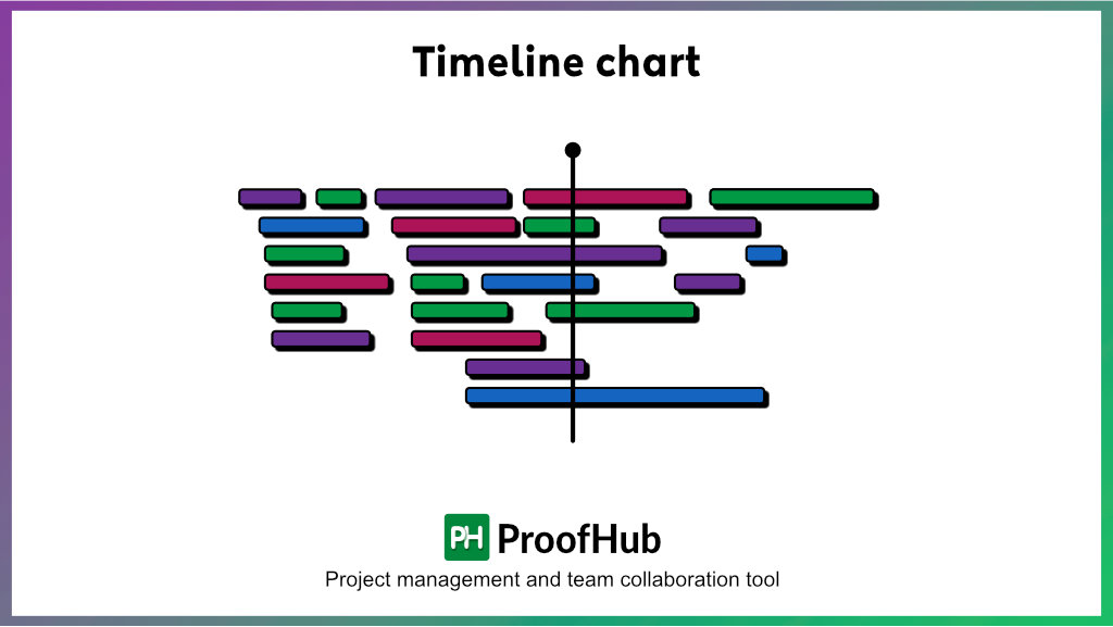
As the name suggests, a timeline chart is a graphical representation of all the past and future events on a time scale. You can use the timeline diagram to track task progress, spot bottlenecks, and collaborate effectively.
While one can easily confuse a timeline with a Gantt chart, both serve different purposes. A timeline chart provides a general overview of the sequence of tasks, milestones, events, and dependencies; the Gantt chart is the more detailed version, defining the chronological order between tasks and resource allocation.
To make your project timeline, start by defining your entire to-do list, estimating the task duration, and identifying dependencies. It acts as a roadmap to keep your team updated on the progress and aligned with defined company goals. You can use it to get a bird-eye overview of project progress to eliminate discrepancies and stay on track.
9. Work breakdown structure (WBS)
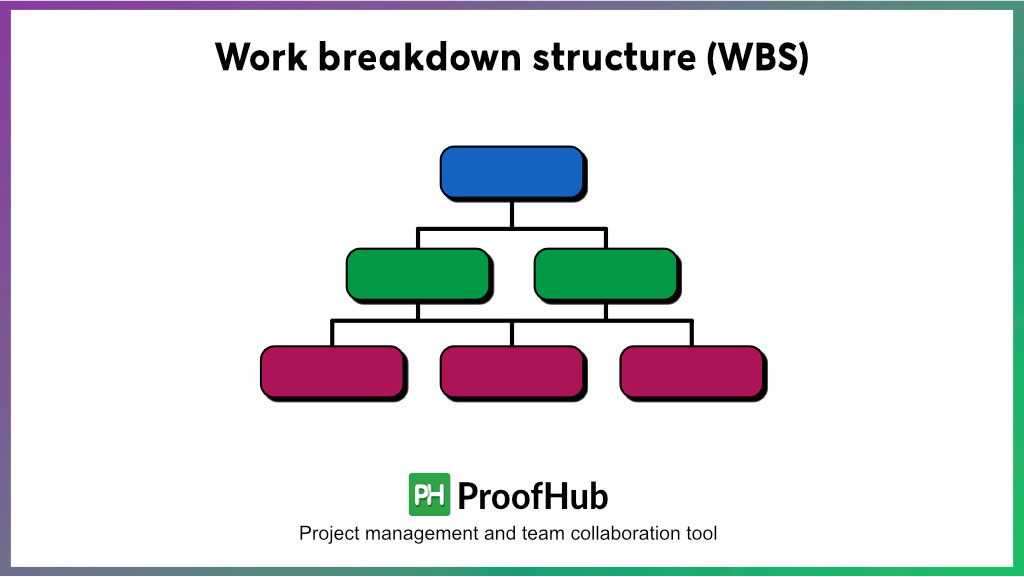
The work breakdown structure is an organized way of dividing a project into smaller manageable sections. The WBS chart is level 1, which contains the main tasks. The tasks at Level 1 are then divided into sub-tasks and listed downward.
While the WBS has no stats or figures to display, it is useful in simplifying how you manage projects. It allows you to execute a project systematically and ensure proper resource allocation.
Work breakdown structure offers a practical way of simplifying a complex project by breaking it into several tasks and subtasks. By breaking down the project and creating a task hierarchy, you can formulate a better project plan, schedule and assign work, and ensure that project work gets executed systematically.
One thing that’s missing in this project management chart is that you cannot define the dependencies among the tasks, and it is not possible to visualize the timeline of the project.
10. Pareto chart
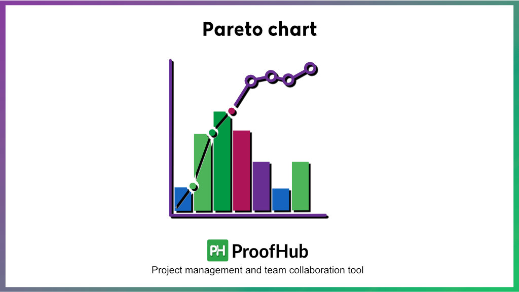
Project managers use the Pareto chart when they need more information about their project than what a typical graph has to offer.
A Pareto chart combines a bar graph and a line graph. By using this chart, you can highlight some specific factors of your project. Typically, Pareto charts are used to identify problems and complications in a project. It helps you determine the most common reasons for a problem; thus, you can take appropriate actions to eradicate it.
Pareto charts provide you with vital information about your projects that you can use to make better decisions. Additionally, these charts are suitable for almost all project management methodologies and greatly aid while performing Six Sigma analysis.
11. Control Chart
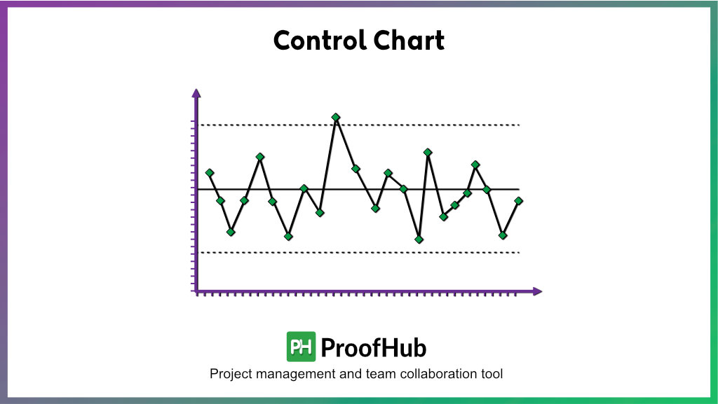
If you want to monitor a specific project process, control charts are the best way to do it. This type of project management chart is popular for observing any erratic change in the process behavior, which makes it possible to identify problems at the early stages.
Control charts offer a reliable way of determining the stability of a process. By ensuring the stability of various project processes, you can ensure that the project executes as smoothly as possible while facing minimum hindrances.
A control chart is more like a graph having an upper control limit, a lower control limit, and a centerline or average process output. The process behavior is considered acceptable as long as the graph line remains between the upper and lower control limits. If the graph line touches or crosses the market control limits, the process behavior has become undesirable.
12. Flowchart
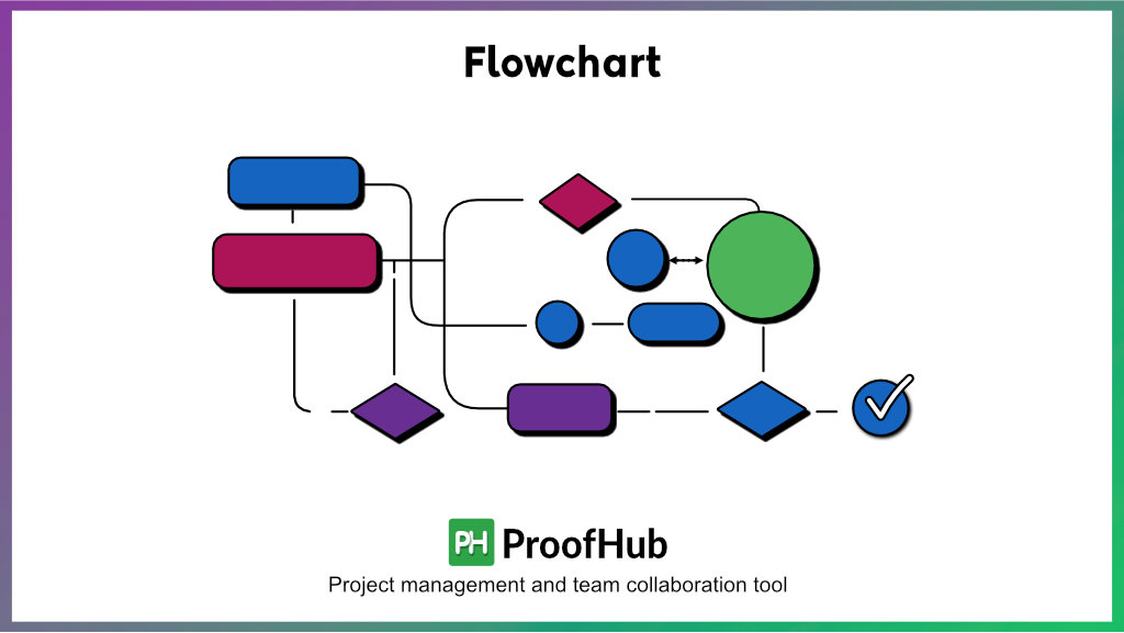
Projects with several processes and a complex flow of activities are challenging to manage. A flowchart is the best solution to simplify such projects and your life when dealing with complicated projects.
For those who don’t know, a flowchart is a graphical representation of the project workflow. It includes all the activities and processes between the project’s start and end. Boxes and figures of different shapes, along with arrows, illustrate the sequence of events and how they are connected.
Flowcharts are a great way to define and share your project’s logic with others, such as your team members, clients, stakeholders, etc. A flowchart provides a clear idea about the project’s objectives and an overview of what will happen during the different project events and phases.
As a manager, you should know that flowcharts are highly effective for small projects. However, creating flowcharts for large projects with too many processes and sequences is not feasible. Flowcharts are combined with Gantt charts for better project management for large-scale projects.
13. Pie Chart
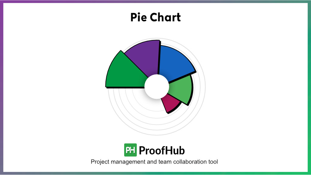
Pie charts are also very simple and quite popular in project management. Just like bar charts, they are flexible and can represent different types of project data. These charts are circular and act as an ideal tool for data segmentation.
The primary purpose of using a pie chart is to illustrate the numeric proportions of different categories that form a collective whole. This type of chart is among the most basic data visualization tools for managing projects for all levels of complexity.
While Pie charts may seem perfect to use under any conditions, one limitation restricts its usage. These charts are specifically suitable for displaying proportions of a limited number of categories, preferably less than 10. When the number of categories becomes too large, the pie chart becomes cluttered, and it becomes difficult to understand the proportions just having a mere look.
If you want to use pie charts for your projects, you can find them integrated into the best online project management tools & software. Also, you will be able to easily leverage the power of modern pie charts to understand your project data.
14. Bar chart
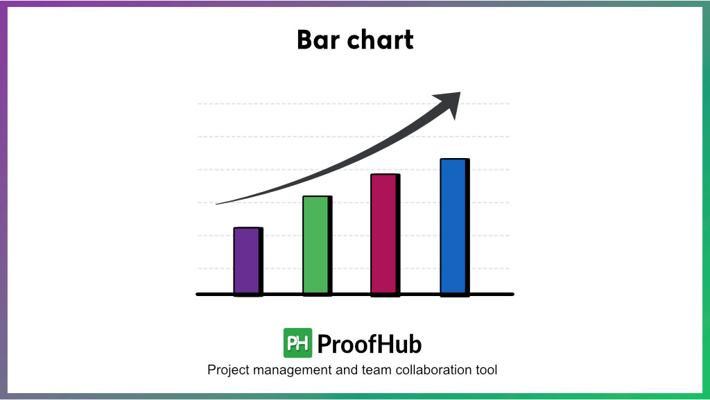
Bar charts are very common in project management because they are simple, versatile, and interpretable. In project management, these charts are used for visualizing a wide variety of project data ranging from the billable & non-billable work hours to the number of completed & pending tasks.
A typical bar chart has two axes, with one axis depicting the different categories to be compared and the other axis representing the comparison parameter. Although the bars can be plotted horizontally and vertically, the horizontal bar charts are more popular.
While managing a project, you may need to visualize some data like how your team is distributing their work hours across different projects. Bar charts allow you to access important information about your project quickly.
Almost all the leading project management software uses bar charts to visualize some of the project data. The software automatically creates and modifies bar charts as the project progresses and new activities occur.
15. CPM Chart (Critical Path Method)
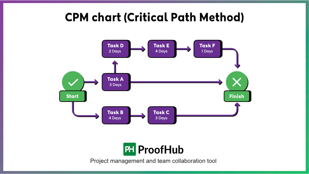
Critical path method or critical path analysis (CPA) chart is a powerful visual planning tool for project management. The method focuses on identifying the critical path, consisting of a more extended sequence of activities, and is crucial for successful project execution.
To locate a critical path for a project, list all project activities and map out dependencies between them. Moving forward, create a network diagram by establishing the chronology between the sequence of activities. You can make a box or circle to represent tasks and use arrows to depict dependencies.
Once done, estimate the time taken for task completion. Avoid guesses and ensure data-driven estimates to determine task duration. Lastly, make sure to clearly define the scope for flexibility in your schedule, with no to minimal impact on the project deadline. Managers can use this chart to determine project schedules, estimate timelines, and identify dependencies.
16. RACI chart
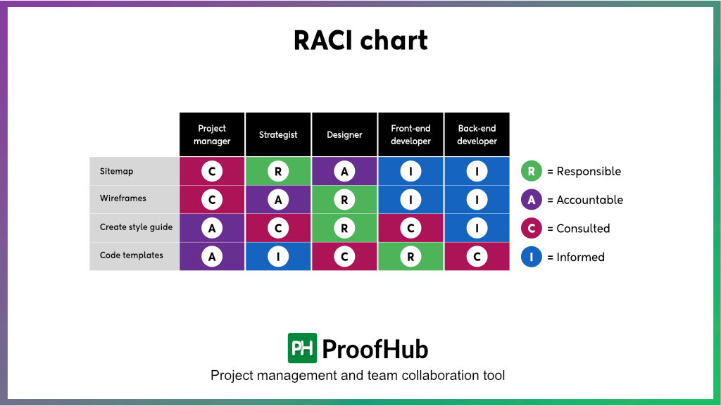
A RACI chart, also called a RACI matrix or Responsibility Assignment Matrix (RAM), helps managers assign responsibilities in project management. The matrix ensures everyone in the team knows their roles, responsibilities, and results expected while ensuring external stakeholders are communicated the necessary updates.
It is an acronym for Responsible, Accountable, Consulted, and Informed.
- Responsible (R): Someone who is solely responsible for the task.
- Accountable (A): Someone who is answerable for the task’s completion and success.
- Consulted (C): Someone whose input, feedback, and advice must be sought.
- Informed (I): Someone who must be kept in the loop about work progress.
This project management chart considers duties, responsibilities, involvement, and engagement to segregate stakeholders into four categories. All you have to do is assign initials R, A, C, and I to denote each person’s role.
17. Cause-effect chart
One of the key responsibilities of project managers in almost all organizations is problem-solving. As soon as a problem or issue arises during the project development, managers have to figure out the causes of the problem and take corrective actions to eliminate it.
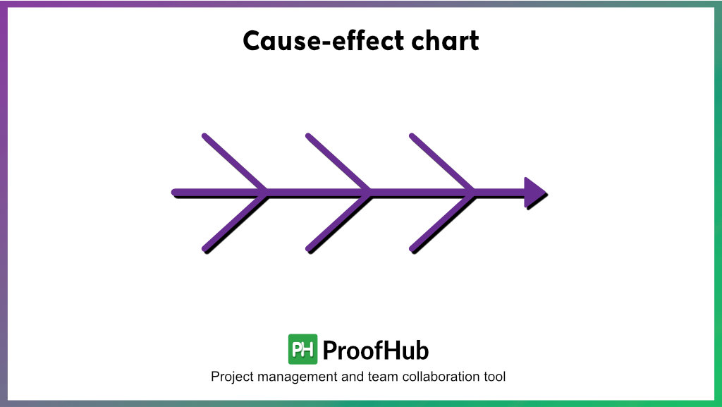
The cause-effect chart allows managers to highlight all the potential causes that give rise to a particular problem. In general, the chart contains information about various causes and their effects that can lead to problems in a project. While creating a cause-effect chart, you must include all the potential causes of an issue. Otherwise, resolving the situation during the actual project development will become challenging.
Cause and effect charts are also known as Ishikawa diagrams or fishbone diagrams. The latter name is because these charts look somewhat similar to fish endoskeletons.
Managers from different industries prefer using cause-and-effect charts to resolve project problems. One main reason behind the significant popularity of cause and effect charts is that they are easy to understand. You can use them to comprehensively analyze the problems occurring in your projects and develop feasible solutions without wasting much of your time and effort.
Apart from problem-solving, you can also use cause and effect charts to conduct brainstorming sessions that yield innovative ideas and solutions.
18. SWOT analysis
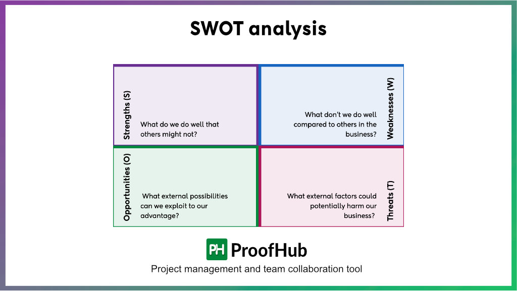
A SWOT analysis is a four-quadrant framework outlining a project or business’s internal and external strengths, weaknesses, opportunities, and threats. It is a strategic planning tool that helps managers make intelligent decisions, prioritize initiatives, and get a competitive edge.
Simple yet meaningful, the analysis doesn’t require much technical knowledge. Managers can use the framework to overview the organization and its strategic position comprehensively. They can hold brainstorming sessions with employees to incorporate diverse perspectives for a well-rounded evaluation.
The ideology behind the SWOT analysis is to capitalize on strengths, eliminate weaknesses, seize growth opportunities, and mitigate threats. No matter how thorough the study is, there is always a tendency for the results to be biased and subjective. This can cause misguided decisions.
19. Eisenhower matrix
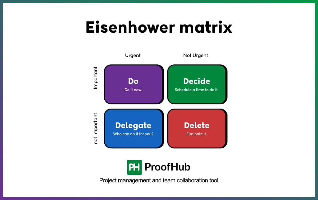
An Eisenhower matrix is a prioritization framework used to prioritize your to-do list. Also known as the Eisenhower Decision Box or Urgent-Important Matrix, the tool helps you prioritize tasks based on importance and urgency in a four-quadrant table.
With urgency on the x-axis and importance on the y-axis, the four-quadrant table can be summarized as:
- High Importance, High Urgency: Do
- High Importance, Low Urgency: Schedule
- Low Importance, High Urgency: Delegate
- Low Importance, Low Urgency: Delete
Based on the categorization, managers can choose their course of action. This means they can either attempt, schedule, delegate, or delete them as per the matrix’s guidance. It helps managers better allocate resources, prioritize tasks, and increase efficiency.
Adopting the method helps employees achieve better work-life balance by allowing them to manage their time better, make informed decisions, and focus on targeted efforts.
20. Power-Interest matrix
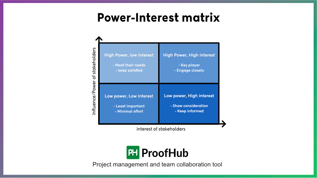
The power-interest matrix, also known as Mendelow’s matrix, is a powerful tool for stakeholder analysis. It helps managers identify and manage stakeholders based on their power and influence on the project.
The four-quadrant grid is divided into two axes, with power on the vertical axis and influence on the horizontal axis.
Power: Their ability to influence decisions and resources
Interest: Their level of interest in the project outcomes
Based on these, you will get four types of stakeholders:
- High power, high interest: Manage closely
Priority: High
- High power, low interest: Keep satisfied
Priority: High
- Low power, high interest: Keep Informed
Priority: Medium
- Low power, low interest: Monitor
Priority: Low
The matrix forms a basis for developing communication strategies and determining the best approach to stakeholders on some issues or projects. Managers can utilize the power-interest grid to decide how, when, and what to communicate to these stakeholders for better engagement and project alignment.
However, one thing to remember: Various stakeholder dynamics and other parameters can cause stakeholders to keep moving between quadrants. So, it is crucial always to cross-check.
What are the key components of project management charts?
Project management charts represent several aspects of a project’s life cycle for successful execution. Here are several key components of these charts:
- Tasks: Tasks are the crucial parameter of a project. These are the specific work items or activities that must be performed to move the project forward and complete on time. These are typically represented as nodes, boxes, rectangles, or circles.
- Duration: Setting a realistic duration is significant in determining the project timeline and optimizing the schedule. It is the estimated project completion time, typically in hours, days, weeks, or months.
- Resources: Resources are the driving forces of an organization, and their optimization is necessary for successful task completion. Resources include people, software, equipment, money, and time.
- Milestones: Milestones are significant progress indicators, marking key stages in a project’s life cycle. These achievements and checkpoints have a more significant impact on project progress and help keep projects on track.
- Dependencies: Dependencies represent how one task is related to another in the list. Their understanding is necessary for effective task sequencing and scheduling. Arrows or lines can represent these.
Timeline: The timeline maps out the entire schedule of a project, including tasks, milestones, events, and deadlines. The visual representation helps managers and teams stay informed and keep projects on schedule.
ProofHub integrates different types of project management charts to help you deliver projects on time. Start your free trial now!
Summing it up
Project management charts can help you systematically manage different phases of project development. The information provided by these charts is easy to comprehend and is of great help for finishing projects successfully.
As a manager, you can use different project charts according to your preference and make your life easier. The charts discussed in this article are viral among managers to improve the quality of their project work and ensure timely delivery.
