Visual feedback is the structured process of anchoring feedback to the exact elements within a creative asset to improve clarity, accuracy, and execution.
Effective visual feedback follows a structured process. Reviewers begin by evaluating the design as a whole instead of reacting to isolated elements. After establishing context and defining clear observations, they explain the issue and its impact on clarity, hierarchy, or user attention to help creators understand the reasons behind the feedback.
They then leave annotated feedback on the specific element requiring attention, suggest precise improvements, prioritize changes based on visual impact, and close the loop by confirming understanding with the creator.
Unlike vague descriptions or detached comments that rely on interpretation, visual feedback provides direct, contextual guidance. This reduces ambiguity, eliminates misinterpretation, and ensures revisions are implemented as intended, leading to faster, more accurate creative outcomes.
What is visual feedback?
Visual feedback is a structured process to evaluate creatives for visual effectiveness, marking specific visual elements directly on the asset, and suggesting precise, actionable changes to ensure accurate execution.
It ensures that creators understand what requires modification and perform the necessary adjustments to deliver accurate revisions.
Unlike text-based feedback that provides general descriptions, visual feedback suggests execution-level changes by anchoring comments directly to the relevant elements.
Visual feedback removes ambiguity, minimizes misinterpretation, and reduces revision cycles, ensuring the final output aligns with the intended concept and design principles.
What are the advantages of visual feedback?
The five key advantages of visual feedback are providing higher clarity, better alignment, faster decision-making, improved visibility and accountability, and quicker approvals.
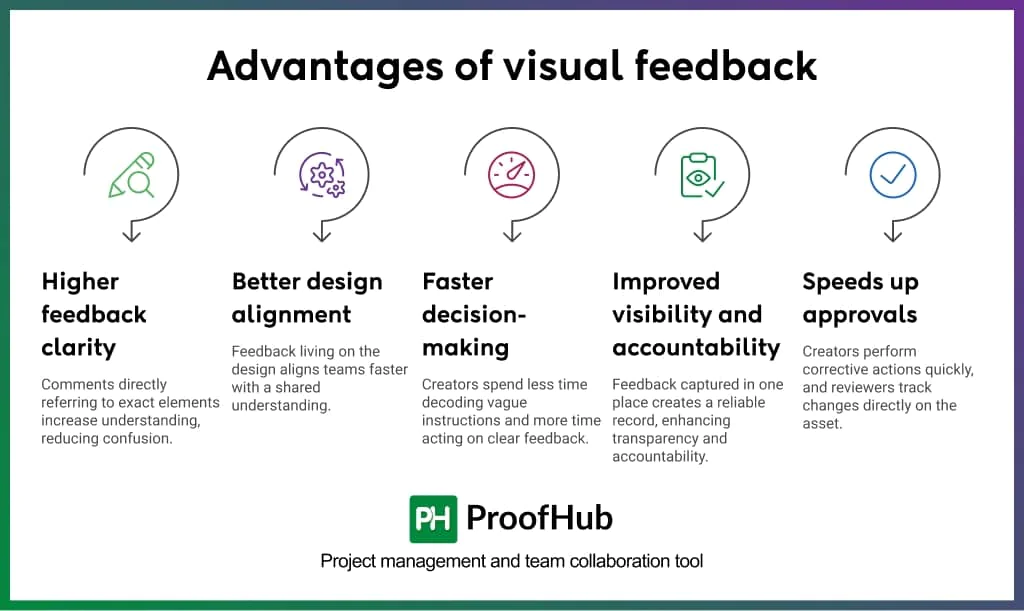
- Higher feedback clarity: Comments that directly refer to exact elements increase understanding of what needs to change and where, reducing confusion and unnecessary back-and-forth.
- Better design alignment: When feedback lives on design, teams align faster with a clear, shared understanding rather than forming multiple interpretations.
- Faster decision-making: Creators spend less time decoding vague instructions and more time acting on clear, contextual feedback.
- Improved visibility and accountability: When all feedback, decisions, and approvals are captured in one place, it creates a reliable record that enhances transparency and accountability.
- Speeds up approvals: When creators perform corrective actions in the first attempts and reviewers can track changes directly on the asset, approvals happen faster.
Steps to give clear and actionable visual feedback on creatives
Giving clear and actionable visual feedback requires reviewers to analyze the full design, annotate specific elements, provide factual descriptions, explain issues with context, suggest precise improvements, prioritize issues based on impact, and confirm alignment with the creator.
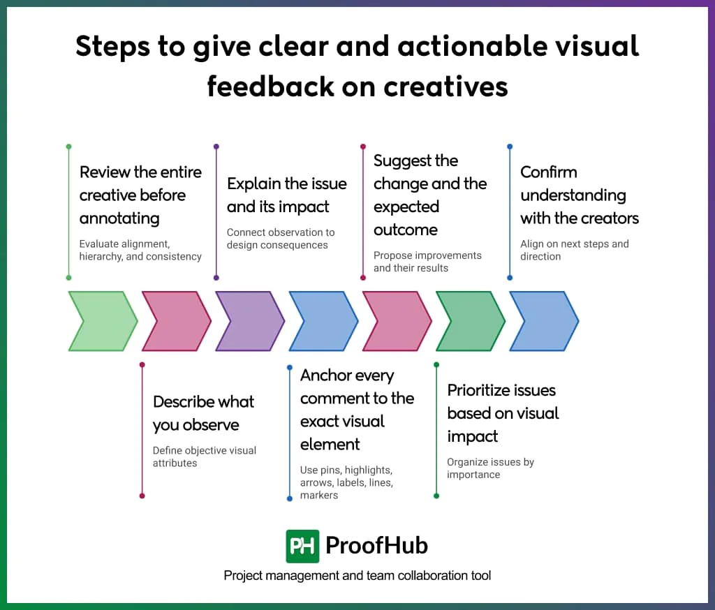
1. Review the entire creative before annotating
Start by evaluating the entire creative to ensure alignment, hierarchy, and consistency across all elements. Before making isolated comments or stating your observations about the disconnected parts, take a moment to understand the creators’ intent and the message the design is trying to convey.
When reviewers take time to thoroughly observe the design, they identify even subtle details that influence clarity, focus, and user attention.
Example (Social media ad creative):
Instead of immediately commenting:
“The CTA button is too small.”
Structured feedback:
“The headline, product image, and CTA are similar in visual weight, which makes it difficult to identify the primary focus.”
2. Describe what you observe
Describing first establishes a shared reference point, allowing both creators and reviewers to align on objectives. It separates facts from being labelled as subjective judgment and prevents vague statements.
Strong observation focuses on measurable or visible attributes:
- Number of elements
- Spacing and negative space
- Color contrast
- Differences in hierarchy
Example (Social media creative):
Unclear feedback:
“The text is hard to read.”
Impact-driven feedback:
“The low contrast between the headline and background reduces readability, and the limited negative space makes it difficult to focus on the main message.”
3. Explain the issue and its impact
Providing meaningful insights allows creators to evaluate what requires change, along with the context they need to understand the reasoning behind the feedback. It connects the observation to its impact on the design.
Impact typically relates to:
- Reduced readability
- Unclear hierarchy
- Divided attention
- Disrupted flow between frames or sections
Example (Video ad creative):
Unclear feedback:
“The second scene feels off.”
Structured feedback:
“Across multiple frames, the alignment of text and product visuals shifts, and the hierarchy changes between scenes. The cuts on the timeline feel abrupt, which disrupts the overall flow of transitions.”
4. Anchor every comment to the exact visual element
Actionable visual feedback is specific and location-based. It helps reviewers leave comments directly on the exact element that requires attention, whether it is a text block, image, frame, or transition point.
It helps creators understand feedback with visual context, eliminating misinterpretation and improving execution accuracy.
Several annotations used to anchor comments directly to the visual elements are:
- Pins
- Highlights
- Arrows
- Labels
- Lines
- Markers etc.
Example (Landing page creative):
Unclear feedback:
“The alignment looks off.”
Anchored feedback (arrow pointing to pricing cards):
“The pricing cards are misaligned along the bottom edge, which breaks visual consistency across the section.”
5. Suggest the change and the expected outcome
Actionable visual feedback clearly defines what needs to change and the intended visual outcome.
It allows reviewers to show creators a clear direction to work in, while giving them flexibility in execution.
Strong suggestions reference design principles such as:
- Hierarchy
- Contrast
- Alignment
- Spacing
- Pacing in transitions
Example (App interface):
Unclear feedback:
“Make the headline better.”
Actionable feedback:
“Increase contrast between the headline and background and add more negative space so the primary message stands out clearly and improves readability.”
The suggestion defines:
- What to change (contrast, space)
- What should happen (clear messaging)
6. Prioritize issues based on visual impact
Clear visual feedback helps identify issues and organize them by importance and impact on the overall design.
Prioritization helps creators focus their time, attention, and efforts on high-impact issues first, before addressing minor refinements. This ensures critical issues affecting clarity and usability are resolved early.
Typical prioritization includes:
- Primary issues
- Secondary issues
Example (Ad creative):
Unclear feedback:
“There are a few things to fix.”
Prioritized feedback:
Primary issue: a weak hierarchy between the headline and CTA makes the main action unclear.
Secondary issue: minor alignment inconsistencies in icons.
7. Confirm understanding with the creators
Clear confirmation helps reduce the chances of mistakes, miscommunication, and rework. It creates a shared understanding of the required changes and how to approach them. This ensures that feedback is correctly interpreted before implementation begins.
Confirmation includes:
- Summarizing key changes
- Validating priorities
- Ensuring agreement on direction
Example (Graphic design creative):
Unclear feedback:
“Make the changes and resend.”
Aligned feedback:
“For the next version, increase the headline size to strengthen hierarchy, use a higher-contrast color for the CTA to improve visibility, and adjust the color palette so the primary message stands out more clearly. Confirm if this matches your understanding before proceeding.”
Best practices to follow for giving visual feedback
1. Address one issue per comment
Instead of combining every observation into a single comment, focus on addressing one issue per comment.
This approach prevents confusion that arises when multiple problems are bundled together, making it easier for creators to act on feedback with clarity and precision.
2. Separate critical issues from suggestions
Distinguish between the must-fix issues and optional improvements to keep priorities clear.
The distinction gives creators clarity on what can’t be compromised vs what can enhance the design further.
3. Consolidate feedback in one place
Use a single, centralized space to provide feedback on visual designs, avoiding duplication and scattered communication.
Centralizing feedback makes it easier for teams to review decisions, track changes, and implement revisions without missing important inputs.
4. Support feedback with context or visual references
Providing context along with the feedback helps creators understand the reasons behind the change, reducing friction and resistance from arising between both parties.
Adding visual references (when relevant) gives creators clear direction, so they know exactly what outcome is expected without unnecessary back-and-forth clarifications.
5. Focus feedback on the work, not the creator
Visual feedback is about the design, not the person who created it.
The feedback that targets individuals creates resentment and reduces openness to improvement. On the contrary, work-focused feedback keeps discussions objective and makes creators more receptive to changes.
6. Use annotation tools to mark visual elements
Rather than leaving vague or general comments, use annotation tools to pinpoint the exact location that needs attention.
The approach removes guesswork and ensures faster, more accurate revisions.
Best tools for giving effective visual feedback
The best tools for giving effective visual feedback include design and annotation tools, visual annotation tools, review and approval tools, video review tools, and visual collaboration tools.
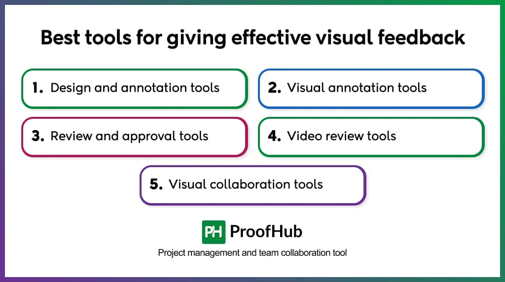
1. Design and annotation tools: These tools are built for creating and reviewing designs within a single, centralized workspace. Example – Figma, Sketch.
2. Visual annotation tools: These tools are built for reviewing finished visuals, like static images, live websites, or previews for quick reviews. Example – Ruttl, Markup.io
3. Review and approval tools: These tools provide structured workflows for managing feedback, tracking versions, and streamlining approvals. Example – ProofHub, Filestage.
4. Video review tools: These tools support timeline-based commenting and frame-accurate feedback on video and motion creatives. Example – Frame.io.
5. Visual collaboration tools: These tools support collaborative discussions, brainstorming, and feedback on shared visual canvases. Example – Miro.
Examples of visual feedback
Here are two examples of visual feedback:
Example 1: Video and motion graphics
A creative agency created a 30-second product launch video for one of their clients. The editor sends the video to the reviewer for their internal review before sending it to the client.
❎ What usually happens:
“The middle section drags a bit. Also, the music does not really match the vibe we are going for.”
✅ What should happen:
The reviewer leaves three timestamped comments directly on the video timeline:
(At 0:12) “The product demonstration holds on the same angle for six seconds without a cut. Trim to three seconds and add a close-up of the interaction.”
(At 0:04) “The problem starts where the visuals pick up pace. The track has a slow ambient feel, which does not follow from this point forward.”
Example 2: Social media creative
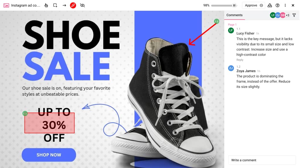
A retail brand created an Instagram ad copy for their upcoming fresh sale. They sent it for approval to relevant stakeholders.
❎ What usually happens:
“The design feels cluttered, and the offer is not clear.”
✅ What should happen:
(Rectangle around “30% OFF” text)
“This is the key message, but it lacks visibility due to its small size and low contrast. Increase size and use a high-contrast color.”
(Arrow pointing to product image)
“The product is dominating the frame, instead of the offer. Reduce its size slightly.”
How does proper visual feedback improve creative workflows?
Proper visual feedback improves creative workflows by eliminating ambiguity, reducing back-and-forth, minimizing revision cycles, and speeding up approvals.
Visual feedback is provided directly on the asset, making it specific, contextual, and easier to understand and act on.
It creates a single source of truth, where every comment, decision, and approval is visible and traceable. Teams know who approved what, which version is final, and where alignment stands, eliminating conflicting feedback and delayed decisions.
This brings structure, accountability, and speed to the entire process.
How does visual feedback improve feedback accuracy?
Visual feedback improves feedback accuracy by being highly descriptive and contextual at the element level.
It replaces text-heavy descriptions with precise, element-level annotations, reducing misinterpretation and making the reviewer’s intent immediately clear.
It closes the gap between what reviewers intend and what creators understand by allowing them to work from the same visual context.
Can visual feedback enhance team collaboration?
Yes, visual feedback can enhance team collaboration by creating a shared visual context that reduces miscommunication and interpersonal friction.
When feedback is added directly to the creative using annotations, all the stakeholders evaluate the same elements in the same context.
When a comment exactly refers to the element, there is no room for one team member’s interpretation to be misunderstood by others. This shared clarity causes fewer misunderstandings between teams and faster revision cycles.
This makes the entire review process more constructive.